As of 2016-02-26, there will be no more posts for this blog. s/blog/pba/
Showing posts with label design. Show all posts

Now?

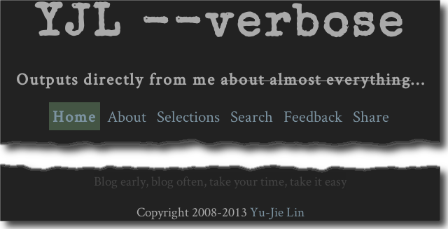
The current header and footer is shown as follows, and they probably would last forever:

New blog header and footer

New blog header and footer

It may look insignificant at first glance or may be considered too small to notice, but its not. Why not? Because we tend to know what to expect at top and bottom of page. You know whats at first line of page whether the text is in 72pt or 8pt, size doesnt matter when the information is known about already. When you need to read blogs name, you scroll to the top and there youd have it.

Even current header looks very simply, I want to simplify more, because Outputs directly from me doesnt mean a lot to me, when I now read it and think about it. I could remove it and move the navigation menu up, next to the title. But lets leave it for next time.

As for the footer, same thing. Only I kept that sort of tag line since it has been on my blogs for more than four years.

Final thoughts

There is no standard defining what has to be in header and footer, and it shouldnt be one. For me, they have to be simple. Ive learned lengthy sentence doesnt equal to being informative. Keep them simple and essential, thats useful and practical.

You do not need a 100-word blog description below the blog title, nor a 100-word disclaimer in your footer. Although, its situational, depends on type of websites, but less truly is more.

You also do not need a fancy header image. Yes, one such image may showcase your artistic designs if your website is about design. However, I have seen a few websites such as photographers, the only images they have are the photos they shoot. Sometimes, no, most of time, text is even more powerful than image. Just like black/white photos can have more impact on the viewers mind than color photos do. The less of complicated element is a trade of more focus.

Nonetheless, there does have times that more is more. Well, only I cant think of one at this moment.

Good header and footer are good when they are.
About a week ago, I resumed blogging and started to revamp this blog. I felt there was too much thing going on unnecessarily.


I removed gadgets at bottom, took down many JavaScript codes and CSS rules, removed theme switching. Now the blog has only dark theme, it used to have switch for color, font, and other style. Fonts have been changed, because I switched to Google Web Fonts, I don't want to serve from Google App Engine. Sooner or later, the bandwidth usage will reach the cap. It actually looks nice with those fonts, though it's quite in different style.

640 pixels, still 640 pixels in width for post content, the same width of most images. Some lines and background color are removed, it looks more seamless when you scroll from top to bottom.

One important benefit from all of these is loading time down to around 5 seconds from 10 seconds. The reduce of loading time is expected since I removed the heck of many things. If I don't use them, then don't put them in. While I was planing the revamp, I checked many blogs which I have subscribed to. 5 to 10 seconds loading time is very common. I've achieved a nice result.

There was one thing I noticed most, other people's blogs don't use footer much. It seems to other people, other than me, they love sidebar. By love, I do mean love. I would say 9 out of 10 blogs have sidebar, and probably half of which don't have footer if you don't count the typical copyright statement line.

I for one who doesn't really like sidebar. I don't have a particular reason, maybe they aren't very useful to me. I always look at top navigation and stuff at bottom of page. Many bloggers stuff too many widgets to their sidebar, it's not a bad behavior, just sort of wasting because visitors don't usually pay much attention to those. At least not after first visit.

During the process, I also tried to find a web service for feedback. At first, I thought GitHub Issues should be good, but not everyone wants to sign up for an account just to post. I didn't want to use very commercial-like service, those have too many buttons and options, I have no idea how to use them.

I then recalled the Google Moderator, that could be a better option, simply because most people have at least one Google account. It's even better when considering the voting, people can rate suggestions or ideas. Most of all, it's simple.

I quite like how my blog looks now, there might still be something I can improve.

Simplicity is a word I like.

Recently, Google Search moved the search options from left-side to top-side:

Left: old design, options at left-hand side. Right: new design: options at top below input box

More space for result?

With the new design, theres a bit more breathing room, ...

I have to say that I don't feel it for web search results. It doesn't seem to add any useful space at all from what I see since the width of result seems to be same, ~500 pixels.

Even with the Knowledge Graph, still looks same to me:


In fact, little more awkward white space on wide screen, which should be everyone's screen type nowadays. If you maximize the window, it always has a lot of white space on search results, that probably will never be resolved. It's fine actually, not really a big issue.

Click harder!

It's bit of strange when using the "Search tools," such as time range. In the old design, you click and options drop down, then you move your mouse cursor directly downward. But with this new design, you have to go left and little bit down. Since the options now is actually drop-down menu style, it requires two-clicks if you want to change from "Past hour" to "Past 24 hours." Less efficient than the old design.

To make this point for clear, please search for "apple tart" in Recipe search. The tick boxes for ingredients were used to be easy to click on, now you have click more times. It's so inconvenient.

Fewer search types shown initially

Another issue with this new design is Video search isn't shown initially, you have to click on "More" to access it. Frankly, I use video search quite often, especially when a song is bugging me. Beside Video search, News search isn't shown, either. I also use News search whenever I hear something, just not as frequent. I think Google tries to maintain the same width as the result area width for the default search type. So, they demote Video and News.

Although I do find search query will promote certain search type, e.g. searching for viral video promoting Video type or "notes app" promoting Application type.

Something is good?

One thing is good from the new design is the image search:


More thumbnails in one page, it's good, right?

Verdict

I can understand why Google want to make it better for tablet and mobile users, but rolled this design to desktop users, I don't feel it's right design.

If I have to give this design a score, I would say 2 out of 5 with this comment: not an improvement.