As of 2016-02-26, there will be no more posts for this blog. s/blog/pba/
Showing posts with label graph. Show all posts

I was wandering when I stumbled on Charsor, which generates a heatmap based on cursor positions. The same thing that I have also done two years ago, X cursor heatmap in terminal using xcinfo, but this new comer uses Tk for screen size and cursor position, and a library for heatmap.

However, none of those above is the reason of writing this post, which is the following piece of code:

import  Tkinter
from    time    import sleep
from    time    import strftime
import  heatmap
import  os

# [snip] #

# Thanks mouad
screenWidth = cursor.winfo_screenwidth()
screenHeight = cursor.winfo_screenheight()

Ive seen many Python codes, all in different styles, and I thought I have seen all, because aligning variable assignments are nothing new to me, I must have seen one or two. Or those spaces wrapping inside of parentheses like some C or PHP codes. Really, I thought I have seen all.

But, never in my life I have ever seen a code that has had the import statements all align up as if its for the commander-in-chief to inspect. Truth is, this kind of style has never occurred in my mind.

Warning

Do not click the link, then open an issue, and tell that guy to PEP 8 up his *BEEP*. It is wrong and cyber-coding-bullying.

And, I must address this, I do not object any Python coding styles as long as its consistent throughout the codes. If you are a PEP 8 firm believer, please do not go scolding this author, take a cold shower to chill. PEP 8 is not the Gods words, there is still a huge distance between God and our BDFL.

Hmm, two space and one space gaps, interesting.

dus is meant to have better output than GNU du -s, which simply summarized the current directorys size (recursively), and bar chart for visualization of sizes.

https://lh3.googleusercontent.com/-fGK67jXeexo/VnSkafYPtXI/AAAAAAAAIpY/4ECerkOqR-8/s800-Ic42/2015-12-19--08%25253A19%25253A28.png

Watch this video for more usages

It has quite a few of options to use, watch this video for examples of some of them:

-0 Use null character (0) as target separator for stdin.
-c <count> Number of items to printout of result head.
--color Colorized output for easier interpretation.
-d Dont enter directory. Only used if a single directory is defined as target.
-h Print human readable sizes (e.g., 1K 234M 5G).
-i Inverted/reverted order of listed result.
-n Enable natural sort order if sort order is a string representation.
-s <...> Sort by property; size, name, atime, mtime, ctime.
-t <ms> File/directory parse timeout given in milliseconds.

You can also pipe in list of directories or files to dus, it reads from standard input as well and gives you the output you want.

dus was created by Rikard Johansson on 2015-10-16, written in C++14 under GPLv3, currently v0.0.6 (2015-12-18).

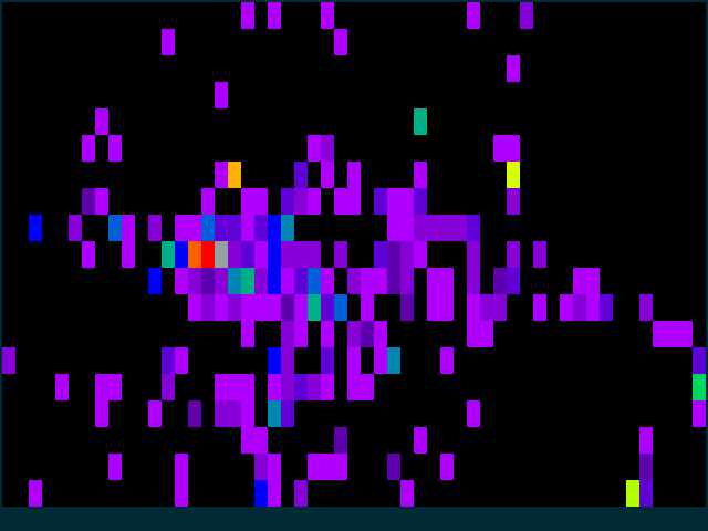
I was really bored and somehow I decided to make a heatmap out of X cursor position in terminal. The following image shows the result and here is a video:

https://lh6.googleusercontent.com/-Iqlh5J3Relc/UmJgkhY9XQI/AAAAAAAAFQ4/fUdM-1pGQo4/s800/xcinfo-heatmap.png

This is just for fun, nothing really useful. The X cursor position is translated into terminal window space, then heating up and the heat would also cool down as time goes by. The heat scale is the rainbow hues, which I roughly calculated into 256 terminal colors.

If you are interested in xcinfo, it might be useful if you need to script with X cursor infomation. I had not touched the code more than a year ago until now.

Before I moved xcinfo to Bitbucket, I had already written script to plot the trail of my mouse movement. The following image demonstrates the movements of 4 hours:

http://2.bp.blogspot.com/-pIuZmkxPwXU/T5XhWHHA20I/AAAAAAAADQo/_I5twVL5Pvk/s800/test.png

For every position my mouse at on screen, it will be render as a circle (radius = 10 pixels) with radical gradient, the position is polled every 0.1 seconds. For consecutively same position is only rendered once.

From what I see, the high density are seem to be around little to the right and bottom of center pointer. This area probably is where I usually have the focus of web page placed and click up on if I do.

Also a horizontal line near on the top edge, and you can also see there is actually a space in the line, thats because I use dwm and usually I have two windows vertically split. That line should indicate my movement over Firefoxs tab handlers.

4 hours would have 4 * 3600 * 10 = 144,000 points at most. If we roughly count the redundant rate is 90%, then its about 14,400 point rendered. But I dont think mine is lower then that. And clearly, there are a vast region which my mouse has never visited because there is no need to when you use tiling window manager and mainly use mouse to control windows.

You can get the code and make one of your own, please head over to project repository and read mouse trail subsection in Examples section.

Just read Visualize your password reuse on Mozilla Lab by Paul Sawaya about this addon, here is a screenshot of my test profile in Firefox:

http://i.imgur.com/wQThC.png

The graph use d3.js and its interactive, you can draw or click, and even to check the clear text of the passwords.

Again, its not the passwords I use daily. No way I will show you that even this is just a visualization. They are a lot can be learned from a simple graph.

I found this is helpful to help your realize how your security sense based on your passwords. A crazy nut of security should have a totally non-connecting graph.

Each green dot is a password, blue dot is the website. Square orange box connecting passwords means those passwords are similar, which by general guidelines of security that should be avoid.

Using different password for different website, but when you are testing. Well, you know abc123 comes in handy. As you can guess, those two only distinct passwords and websites are the actual passwords, and I am not going to tell you what they are. :)

PS. abc123 may just be a misleading to let you believe I use that for testing, please dont use it to hack into my account. ;)

After I posted my first try of using Google Analytics Data Export API, I realized that I didnt need to send two requests for calculating visits change, one is enough. Moreover, I could also make a chart.

=== General ===

125 |                                                          #
    |                      #           ##      ##            ####
    |                      #           ###     ##     ##    #####
    | ##                  ###   ##  # ######   ## #  ####   #####
    |####  # #    # #  # #####  ############  ##### ###### ######
    |#### #####   # ## ##########################################
    |###########  ###############################################
    |########### ################################################
    |############################################################
    |############################################################
    |############################################################
  0 +------------------------------------------------------------

  116 visits (  -7.20%)
  Average time on site: 122.655172414 seconds (  55.75%)</pre>

I wonder if there is a popular Python library or common CLI tool to make an ASCII chart.

DAYS = 60
date = (dt.datetime.now() - dt.timedelta(days=1)).strftime('%Y-%m-%d')
date_start = (dt.datetime.now() - dt.timedelta(days=DAYS)).strftime('%Y-%m-%d')

# General
###########
data_query = gdata.analytics.client.DataFeedQuery({
    'ids': table_id,
    'start-date': date_start,
    'end-date': date,
    'dimensions': 'ga:date',
    'sort': 'ga:date',
    'metrics': 'ga:visits,ga:avgTimeOnSite'})
feed = my_client.GetDataFeed(data_query)
visits = [int(entry.metric[0].value) for entry in feed.entry]
max_visits = max(visits)
print '=== General ==='
print
CHART_HEIGHT = 10
VISIT_WIDTH = len(str(max_visits))
for y in range(CHART_HEIGHT, -1, -1):
  if y == CHART_HEIGHT:
    sys.stdout.write('%d |' % max_visits)
  else:
    sys.stdout.write('%s |' % (' '*VISIT_WIDTH))
  for x in range(-DAYS, 0):
    vst = visits[x]
    # vst / max_visits >= y / CHART_HEIGHT
    if vst * CHART_HEIGHT >= y * max_visits:
      sys.stdout.write('#')
    else:
      sys.stdout.write(' ')
  sys.stdout.write('\n')
  sys.stdout.flush()
print '%s0 +%s' % (' '*(VISIT_WIDTH-1), '-'*DAYS)
print
visits_change = 100.0 * (visits[-1] - visits[-2]) / visits[-2]
avg_time = float(feed.entry[-1].metric[1].value)
avg_time_before = float(feed.entry[-2].metric[1].value)
avg_time_change = 100.0 * (avg_time - avg_time_before) / avg_time_before
print '  %s visits (%7.2f%%)' % (visits[-1], visits_change)
print '  Average time on site: %s seconds (%7.2f%%)' % (avg_time, avg_time_change)
print

I was window shopping at Community Contribution of Arch Linux Fourms for totally free new application, tried to see if I can find new toy. I saw this HC, after I read and saw some examples the author posted, I decided to give it a try.

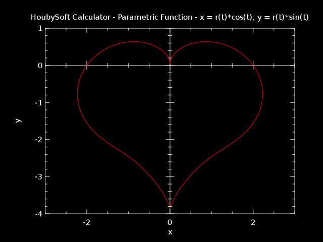
1   Happy Valentines Day!

Too early? or too late?

r(t)=2-2sin(t)+sin(t)*sqrt(abs(cos(t)))/(sin(t)+1.4)
graphpeq(r(t)*cos(t),r(t)*sin(t),0,2pi,-3,3,-4,1)

2   No recursion? You cant stop me!

If you try to define a recursion function, you will get:

fib(n)=if(n&gt;=0,
  if(n==0,0,
    if(n==1,1,
      fib(n-1)+fib(n-2)
      )
    )
  )
Error : recursive definition.

Lets trick HC!

fibr(n)=fib(n)
fib(n)=if(n&gt;=0,
  if(n==0,0,
    if(n==1,1,
      fibr(n-1)+fibr(n-2)
      )
    )
  )

Some outputs:

> fib(10)==fibo(10)
1
> fib(70)
Error : too much recursion/nestedness. If you know what you are doing, you can bypass this with:
 \bpn.
Argument Error : if() : at least two arguments are needed (condition, true_branch, false_branch)
> \bpn
By pass is now on.
> fib(70)

You will have to wait until only God knows how long it takes

Note

Now, HC is allowed to define recursion function:

fib(n) = if(n<2,n,fib(n-1)+fib(n-2))

, read more. (2010-08-24)

3   FFT! The FFT!?

Yes, the Fast Fourier transform!

fft(x)=for(k=0,k&lt;length(x),k+=1,
  xk=0;
  for(j=0,j&lt;length(x),j+=1,
    a=x[j];
    b=exp(-2pi*k*j*0i1/length(x));
    xk+=a*b;
    );
  print(xk);
  )

Example:

> x = [1,0,3i-3,4i5,5]
> fft(x)
13i2
-7.8203160070896799i3.7250338450183462
6.7264861191111235i2.6059037339171068
-8.4904181416113337i-1.3698357564173172
1.5842480295898901i-6.9611018225181358

Confirmed by result from SciPy:

>>> import scipy
>>> scipy.fft([1,0,3-3j,4+5j,5])
array([ 13.00000000+2.j        ,  -7.82031601+3.72503385j,
         6.72648612+2.60590373j,  -8.49041814-1.36983576j,
         1.58424803-6.96110182j])</pre>

Note: the representations of complex number are different.

Note

Here is a shorter version:

fft(x)=for(k=0,k&lt;length(x),k+=1,
  for(j=0,j&lt;length(x),j+=1,
    a=x[j];
    b=exp(-2pi*k*j*0i1/length(x));
    xk=if(j==0,a*b,xk+a*b);
    );
  y=if(k==0,[xk],join(y,[xk]));
  )

(2010-08-24)

The result can be retrieved by y.

4   Conclusion

This is a great CLI program, I am going to replace SpeedCrunch. You can do some simple programming, though I found its still limited. (What do you expect? Signal processing using a calculator?) When I installed SpeedCrunch because I wanted one can allow me to easy input, bc is not so friendly, even I prefer CLI over GUI. Now, HC can do things I need and its a CLI and its resource-friendly. Definitely the top choice for me!

It has vector but its not much you can do with it at this moment, but if you just use it for 1+1, it can do much more than that. If you dont like CLI, dont worry, it provides GUI as well. But I didnt try it, so no comments on that.

Note

Now I use Google Docs to record the number, see this doc. Its easier to add a data point, the only problem is its too ugly. (2010-06-03)

The chart below is the weekly users of Keep Last Two Tabs, a Chrome Extension of mine. This extension does what it claims, its silly and amazingly to see the number of users is actually growing up.

A week ago, I stumbled upon Flot, a pure JavaScript plotting library for jQuery. It produces nice and pretty chart comparing to Google Visualization APIs Annotated Time Line, a Flash based. Here is a post about how I used it.

I feel Annotated Time Line is more easier (or less customizable) to use because you dont need some functions, but Flot is more comprehensive library (and its Open Source), you can have more types of chart and make the chart do whatever you want if you know JavaScript.

I have seen some of visualizations of repositories of softwares. I saw Gource via a post on FriendFeed, its really simple to compile it and easy to use. You only need to give it the root directory of a repo if its a Hg or Git.

The followings are some of mine

1   Commands

Just for the record:

gource -640x360 --start-position 0.3 --stop-position 0.7 -s 1 --file-filter "/((Bash|ChromeExtension|GoogleAppEngine|GoogleGadget|JavaScript|Miscellaneous|Python|lastweet|twitter-python-client|twitter-tracker)/.*|Blogger/\w+\.\w+)" --output-ppm-stream - --output-framerate 30 ~/p/yjl | ffmpeg -y -b 3000K -r 30 -f image2pipe -vcodec ppm -i - brps1.mp4
gource -640x360 --stop-at-end -s 1 --output-ppm-stream - --output-framerate 30 ~/p/brps | ffmpeg -y -b 3000K -r 30 -f image2pipe -vcodec ppm -i - brps2.mp4
gource -640x360 --stop-at-end -s 1 --output-ppm-stream - --output-framerate 30 ~/p/lso | ffmpeg -y -b 3000K -r 30 -f image2pipe -vcodec ppm -i - lso.mp4
gource -640x360 --stop-at-end -s 1 --file-filter "/Blogger/brps/.*" --output-ppm-stream - --output-framerate 30 ~/p/yjl | ffmpeg -y -b 3000K -r 30 -f image2pipe -vcodec ppm -i - yjl.mp4
gource -640x360 --stop-at-end -s 1 --output-ppm-stream - --output-framerate 30 ~/p/twimonial | ffmpeg -y -b 3000K -r 30 -f image2pipe -vcodec ppm -i - twimonial.mp4
gource -640x360 --stop-at-end -s 1 --output-ppm-stream - --output-framerate 30 ~/p/lilbtn | ffmpeg -y -b 3000K -r 30 -f image2pipe -vcodec ppm -i - lilbtn.mp4

(Also posted to Gentoo forum)


Seeing a visualized dependency graph of a package should be always interesting. I read a post on Arch Linux Forums, which generates very beautiful images of your Arch Linux. I was thinking to add a support for Gentoo, but after reading the code, I decided to write my own completely.

Actually, I only did a half of work. My code doesn't not render the image but using Graphviz to the job. It requires packages gentoolkit and graphviz. There are few usage examples written at top of the script.

Here are two quick examples: First one is the Dependency of portage

dep graph of package portage on Twitpic

Second one is big, whole world highlighting python.

You can read the code and download it.

The result should be reflecting installed packages and used USE flags on packages at the time of installing. I didn't take a look at the results very deep, so I am not sure if they are 100% correct since I don't know if I interpreted the data from gentoolkit correctly or not.

I think it's fun to see the visualized dependency data. The code needs Graphviz to render the image, and I think I didn't configure it well. So if you generate whole world, the result is hard to read.

Hope you would like it and give me some feedback.