As of 2016-02-26, there will be no more posts for this blog. s/blog/pba/
Showing posts with label Pentadactyl. Show all posts

If you are a user of Pentadactyl, you might have noticed whenever you press y on a video of YouTube, you always gets the shortlink. It's been a few months since I first noticed this nice feature.

Recently, I wanted to learn about it, before I dug into codes to find out this fantastic feature is from, I always assumed that's somehow YouTube's effort. I thought there must be some way to intercept URL copying in address bar. Some hook, I supposed. But I was wrong totally, however, gladly, I didn't dive into those minified JavaScript codes.

I first discovered YouTube have a shortlink relation in its HTML,
<link rel="shortlink" href="http://example.com/promo">
This really gave me a hint, so I read Pentadactyl's changes and saw this addition:

Added 'yankshort' option. [b8]

 It is all clear to me now. By default,
:set yankshort
--- Options ---
  yankshort=youtube.com,bugzilla.mozilla.org
There seems no options to disable shortlink yanking unless you remove the site from yankshort option, if you really need the full URL and don't want to copy from address bar or statueline. A quick resolution is to map a new key to yank full URL:
map Y :yank gBrowser.contentDocument.location.href<CR>
I really have no idea why I thought YouTube did that. Anyway, I think browsers should provide a link copying button or menu item with shortlink as an option, I saw none in Firefox. I guess this is the reason that YouTube provides shortened link option in share panel.

In Blogger

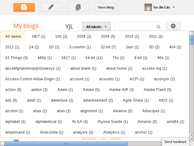
I have mentioned that my labels has grown out of control, 2,119 labels as of 5/8. It's always been a daunting task whenever I need to apply a label to multiple posts or remove therefrom. See for yourself:


See how short that blue grip is? A slight mouse movement could skip dozens of labels easily. When writing, it's basically fine, because it has filter and auto-completion. But in the posts management, no label filter. I have to scroll down carefully.

I added a user style in Pentadactyl to expand the list box's width:
" maximize Labels popup in Blogger
style http://draft.blogger.com/blogger.g* <<EOF
div.blogg-menu-popup {
    left: 0 !important;
}
div[role="listbox"] {
    max-width: none !important;
}
div[role="listbox"] > div > div {
  display: inline-block;
}
EOF
This resolves the issue. Now it looks like:


Even expanded in post writing, too:

In Google Reader

The same situation happens in Google Reader as well, though it's not as severe as in Blogger.


And the following code is similar to one for Blogger:
" maximize Labels popup in Google Reader
style https://www.google.com/reader/view/* <<EOF
.subscription-folders-menu {
  left: 0 !important;
}
.subscription-folders-menu div[role="menuitem"] {
  display: inline-block;
}
EOF
The folders listbox now looks like:

Sometimes, I got confused with what the program I was currently using. A few times, I tried to save files in other text editors or word processor by typing in :w.

I have a script to check live Justin.tv streams I follow, always ran it in shell. But moments ago, I forgot I was in Pentadactyl and wondered why auto-completion didnt finish that command for me. Somehow, I even remembered the exclamation mark in :!chk-jTAB. I had never tried the same in Vim before, either.

A few taps of TAB, I finally realized I was using the web browser. Out of curiosity, I manually entered the rest of command name and it gave me:

http://2.bp.blogspot.com/-rfXBJ4251XY/T53CRgtxRaI/AAAAAAAADR8/fPYmD6FX1fU/s1600/2012-04-30--06:19:53.png

I thought I might need to use io.system for the output, but I didnt need to. In terminal, it looks like:

http://3.bp.blogspot.com/-aZrkoyWYwP8/T53CeBUBzNI/AAAAAAAADSE/JE5Q7fTSbDk/s1600/2012-04-30--06:36:02.png

Of course, this also works in Vim and it even has auto-completion. It doesnt necessary mean I will run this script in web browser whenever I need to check up, I still prefer to read in terminal.

Subconscious has strong influence in me.

Okay, I confess that I might have some tabby issue. I wrote Keep Last Two Tabs extension for Chrome to prevent accidental quit.

I think it has been a long time, I always have to manually create a tab beside the pinned tabs in Firefox. Somehow, I can feel comfortable without an unpinned tab. It has to be look like


There must be one unpinned tab! (Any good shrink? xD)

Actually, it makes sense since you don't want to change URL of pinned tab, that's why you pin it at first place, isn't it? As a Pentadactyl user, I can always your keybinding for new tab, so I will open URL in new tab directly.

But every time when I look at the tabs bar, it just doesn't feel right without an unpinned tab.

So, I added few code to my configuration of Pentadactyl. I need to implement in Firefox, not on top of Pentadactyl by using autocmd, which does not have tab removal event. However, you can check tabs with LocationChange, but that will have many unnecessary checks.

Note that closing animation will cause tab still remains for a short time after TabClose event is fired, but it can be checked as you can see in my code. The code also takes care when open tab just gets pinned by attaching to TabPinned, it will immediately create a new tab.

I think the code could be used directly in Vimperator as well.

I am glad Chromium is not my main browser, or I will also need to add new option to KLTT for similar thing.

Click trapping is a good thing to prevent you from accidentally clicking on something while you only want to preview the output of your post. But I need to be able to click because I check related posts to see if I can add related internal links for currently writing post.

So, a quick solution:
" get rid of clickTrap of Blogger post writing preview
style blog.yjl.im div.blogger-clickTrap { display: none }
or
" get rid of clickTrap of Blogger post writing preview
style [blog-name].blogspot.com div.blogger-clickTrap { display: none }
for non-custom domain blogs.

No add-on/plugin or whatsoever required, Vimperator/Pentadactyl makes things easier and fixes quick. One-liner, that's all. I used to remove it by using FireBug to delete that element, four clicks, I think.

I do think Blogger should offer an option to disable it, because not everyone is a fan of that. And I do prefer to check links by hovering over link anchors and read the status bar.

Also, on Blogger, you can code JavaScript in your blog post which is awesome for JavaScript topic bloggers, so some UI may be displayed and interaction is needed. Though this is very rare case, 99% people wouldn't code and I don't actually code directly on Blogger but with local file generated with reStructuredText. So this part doesn't cause trouble for me at all.

Once again, I switch to something better. But this time is different, it's not the Vimperator broken, well it is in some sense of interpretation. It's because the basis of philosophy. I would never expect myself switching because this kind of point of view. I always think people who so insist in using Open Source are like Saints. (Hope you get what I really mean in that)

Anyway, after I posted about encryption status in Vimperator, I stumbled on this wiki page, VimperatorVsPentadactyl. Now I see why they have been getting rid of us.

Right now, I have switched to Pentadactyl. Here is the diff of what I have changed. It virtually produces exactly same result as before.

A few things I have learnt:
  • Vim syntax file is generated by running :mks in Pentadactyl. It will put the file at right place for you.
  • Colorscheme extension is .penta.
  • guioptions not toolbars, since that's where it was. It also has option for statusline, so I don't need to hack the style anymore.
  • You need to define function in window in your ~/.pentadactylrc, i.e. window.func = function(){};. this !== window.
  • :if :elseif :else :endif is nice.

Pentadactyl intergates statusline with the Addon bar, so those addon button, you can see next to the statusline. I personally do not like this. But I like the loading indication, which is what Vimperator nuked. And the encryption status, also what Vimperator nuked. I now understand how many stuff Vimperator has erased.

I have known Pentadactyl long ago, at that time, Vimperator has made a lot of changes, so I decided not to switch. But, it doesn't really seem to change much, some of my code I didn't even touch.

Two things I have to complain is now I need to get used to C-V and C-Z after I finally got comfortable with inhuman Ins or S-Esc.

The latter is the worst keybinding throughout the computing history, though insert key isn't much better, that takes me eons to get used of them. They should've just tell those people, use your mouse to uninstall Vimperator, problem solved!

The second thing, the name is...

Time for the final step:

:extdelete Vimperator

Mission accomplished.

Simply execute:

:set guioption!=s

Or you can bind it to any key you like.

1   Old content for Vimperator

I have wanted to hide the statusline for a long time, but never got any luck to do by myself and to find a solution. Its hard to google it because people use wrong term. Some said status bar, some said command line. But the correct name is statusline, however more proper thing we are looking at is the grandparent node of statusline, bottombar. command line is only visible when you enter command line mode, so thats really not the right name.

Anyway, I read the FAQ and found there is already an entry about auto-hiding1. The linked file is gone, but I did google and get the file. I didnt try it because that plugin has too many functions that I dont need and its too old, I doubt it would work with latest Vimperator. However, it did give me an idea what element ID I should be looking for at first.

Now I have the following code in my rc:

map <silent> <C-F8> :js toggle_bottombar()<CR>

:js << EOF
function toggle_bottombar() {
  var bb = document.getElementById('liberator-bottombar');
  if (!bb)
    return;
  bb.style.height = (bb.style.height == '') ? '0px' : '';
  bb.style.overflow = (bb.style.height == '') ? '' : 'hidden';
}
EOF

Using Ctrl+F8 to toggle. Note that when you want to enter a command, you need to bring bottombar back first manually. I am sure I can hook/wrap something so when enter command line, the bottombar can be brought back automatically, but I am too lazy to find out how to do that.

[1]Scroll down to How can I hide the command line when its not in use?